
Good Afternoon,
I want to talk to you guys about this awesome indicator that I started using. It is really helping me seal the deal when I trade options on the stock market.
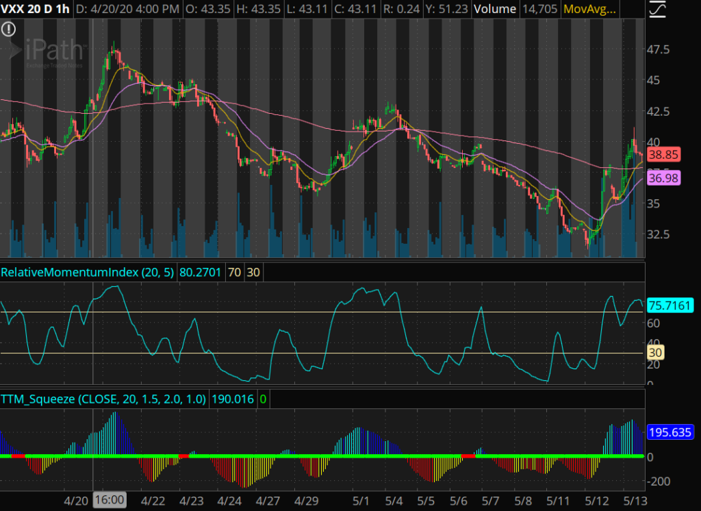
The indicator I am talking about is called the TTM_Squeeze.
The TTM_Squeeze is the trailing twelve months squeeze indicator.
It uses Bollinger Bands and Keltner’s Channels.
I don’t want to go into details about how the Bollinger Bands and Keltner’s Channels work, because you really don’t need to know that much detail to understand the mechanics of this indicator.
There are 3 things you need to know to understand how the TTM_Squeeze works.
The first thing you need to know is the buying signal, this is indicated by blue bars. In this phase, the stock is being bought more than it is being sold.
There are two types of blue bars: cyan colored bars and dark blue colored bars.
The cyan colored light blue bar indicates the stock is heavily being bought. The stock price should be rising very fast in this phase.
The dark blue colored bars means that the buying is starting to slow down a bit. The stock price will slowly rise in this phase. It is often a sign that the reversal is about to happen, and there will be a sell off soon.
The second thing is the selling signal. This is the opposite of the buying signal. More selling is happening than buying and the stock price should be dropping.
There are two colors for this indicator: red colored bars and yellow colored bars.
The red colored bars indicate the stock is heavily being sold. This should tank the stock price.
The yellow colored bars indicate that the stock selling is slowing down. The stock price won’t be dropping as fast. This is often a sign that the reversal is about to happen, and there stock will be bought back up soon.
The third thing you need to know is the height of the bars. When you see the blue bars with a taller height, the intensity of the buying is a lot higher. Taller red and yellow bars means that the intensity of the selling is a lot higher.
The opposite occurs when the height of the bars is short. When you see short blue bars, the intensity of the buying is a lot lower. When you see short red and yellow bars, the intensity of the selling is a lot lower.
Sometimes there is a pause in between the different color bars. This results in consecutive red dots. The red dots indicates a pause in the stock price. This is a period of consolidation. In other words, the buying and selling phases are in equilibrium.
Depending on news catalysts, the relative momentum index, and buying patterns, you can use this pause period to predict if the stock is going to continue going up or continue going down.
As long as the SPY is going up, the pause period usually transitions into another buying phase. In most cases, the stock should continue going up.
It is the opposite if the SPY is going down, the pause period usually transitions into another selling phase. In most cases, the stock usually begins to crash.
Take a look at the colored bars on the chart below.
You will see how the different colored bars follows the direction of the stock price.
Take a look at my video for additional TTM_Squeeze help.
Stay tuned, learn more, ask questions. Become a 6 digit survivor. Check out the live stream.
Join my robinhood team and get a free stock here
Learn about my Indicators here.
Become a member and learn!
Disclaimer:
I want to point out, I am not a registered investment adviser or broker/dealer. I am a highly profitable options trader who has been successful time after time, and I have changed the lives of many people through the art of trading on the stock market.
– Ken